Raising LastPass's accessibility score from 69% to 83%

|
An accessibility overhaul of the LastPass web app, desktop app and browser extension. It shipped on the 10th Global Accessibility Awareness Day.
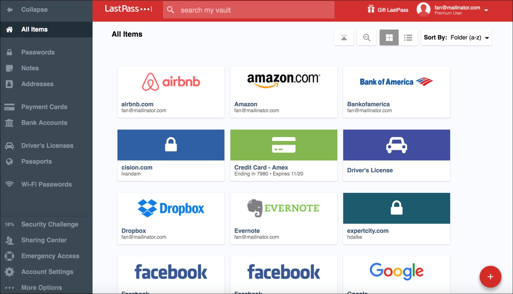
The original screens went down with a corrupted drive, so this one is mostly words and code. The vault above is a LastPass screenshot of the version I worked on. LastPass wrote about the release itself: Global Accessibility Awareness Day, the accessibility commitment and the VPAT report. ProblemSales wanted to expand into more regulated sectors like banking and insurance. Those buyers want a VPAT score of 80% or higher, and ours was mediocre at best. Our team's deliverable was a VPAT report we could hand to buyers. We also had a concrete starting point: a potential partner sent over an accessibility report their own expert had made. Those were the things we had to fix before they would even talk business, so they came first. My roleOn paper I was the senior product designer leading the overhaul. In practice I was hired to do whatever it takes, and here that meant code. Nothing happened in Figma: the UI barely changed beyond text contrast and font size fixes. The real work was under the hood, like turning things that only looked like navigation into real navigation. We had a long list of violations and two months to fix them. This could even be the start of a joke: “A designer, a PM and five developers walk into an accessibility disaster…” Validating the partner's list issue by issue, I kept finding more. The devs wanted to get the list done, which is fair, that's what a list is for. But fixing it item by item would have been a band-aid on a list of bugs. So I became the enforcer, aka the “pain in the butt”, on the project. Being comfortable on the frontend helped a lot there: I filled the designer position and added one more dev to the roster as a bonus. When I argued that something needed a proper fix, I could often do it myself, and let the others follow the official list.
Not the original code, but the kind of change behind most of the work: things that only looked like navigation became real navigation. Key decisions
All of this meant constant negotiation with the engineering manager and the project manager, to avoid scope creep but still get things fixed properly and future-proof.
The same story, smaller. Every button became a real button. OutcomeKeyboard navigation and screen reader support were close to non-existent when we started. After two months of intensive front-end refactoring, the score was 83%, and the app became fully usable with assistive technologies. The changes that mattered most: full keyboard navigation, valid ARIA announcements, and the ever-popular one where every button became a real button. We couldn't fit the full app rework in the time window, but we did our best and covered the most vital interfaces, which made the experience better for all our users right away. I know I was a real pain on this project. But if I hadn't been, it would have stayed a band-aid. Not because of the team: they had their heart in the right place and got on board quickly. The real reason is that most projects and companies simply miss these things during development, and our job as designers and developers is to make sure they're always remembered. My efforts and stubbornness earned me a place in GoTo's Accessibility Champion program, advocating a11y standards across the organization. “He also managed to push through some vital a11y changes to a product which then received praise from disabled customers and helped us hit accessibility standards.” |
|
<< Juuku | ~ Krisztián’s Portfolio Webring ~ | Warface Auction House >> back to my homepage |


